Real-time Monitoring
NetFUNNEL's real-time monitoring interface is designed so you can see service traffic at a glance and make operational decisions quickly. This guide covers screen layout, main UI elements, and how to use the controls you need in day-to-day operations.
Overview
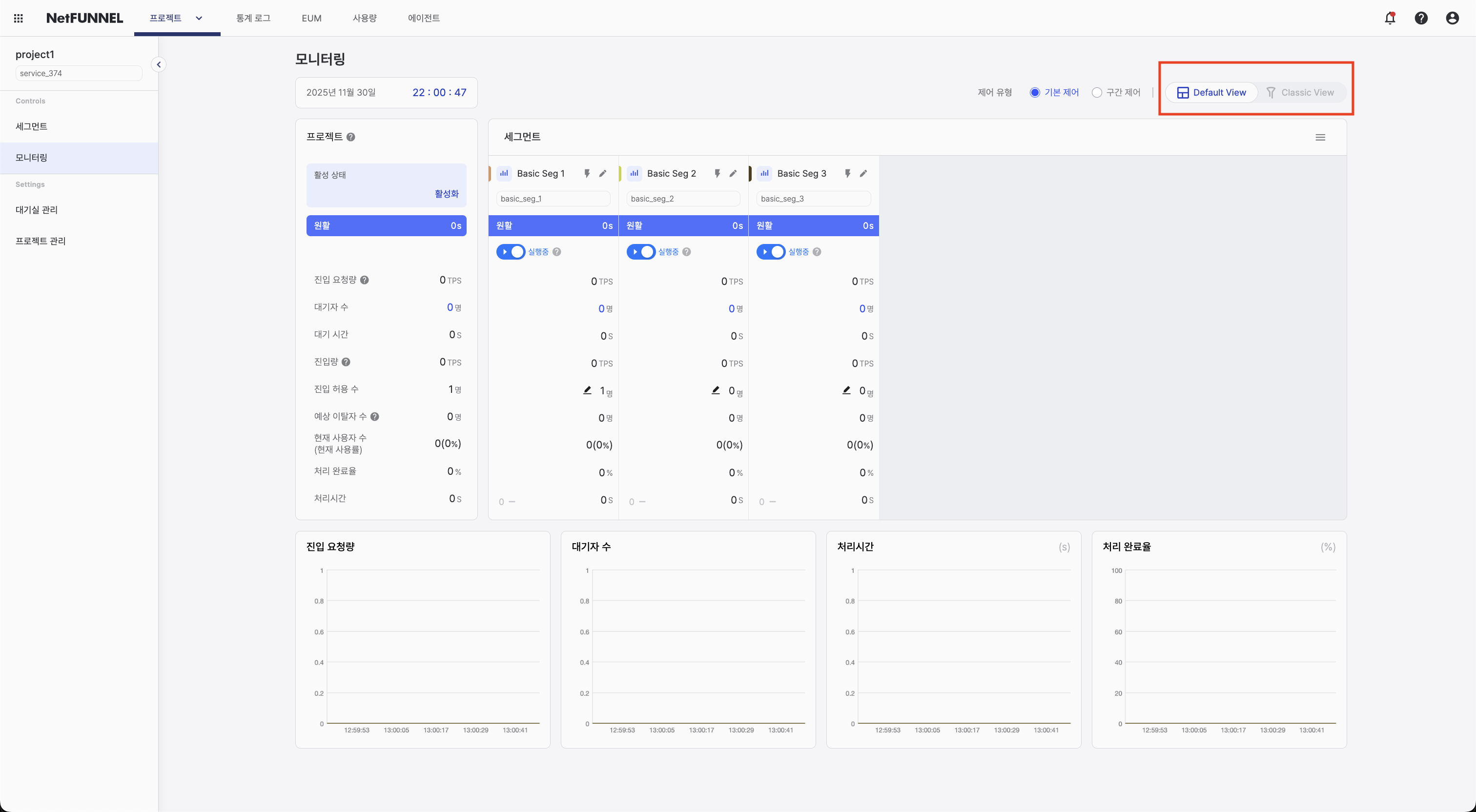
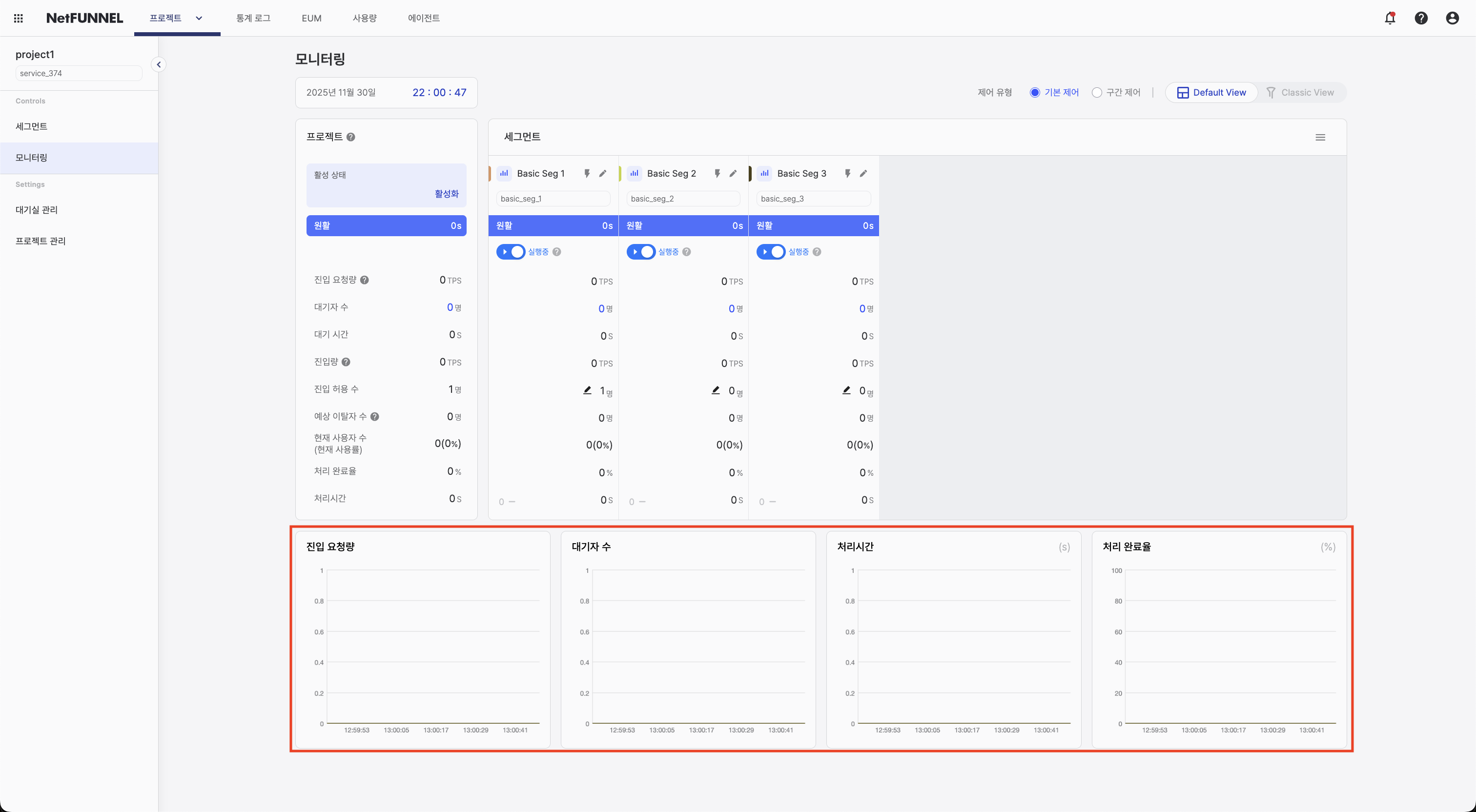
Real-time monitoring offers two view modes. Use Default View when you need table-based numbers for fast decisions; choose Classic View when you want to follow overall traffic flow with an intuitive animation. Both modes share the same data, so you can switch freely with the selector at the top right to match the situation.
View Mode Selection
Use the selector at the top right of the screen to change the mode.
All metrics refresh automatically every second without manual reload, reflecting the current traffic state.
Default View
Default View shows information in a structured table. It is useful when comparing numbers across segments or when you need to judge Limited Inflow accurately during an operational event.
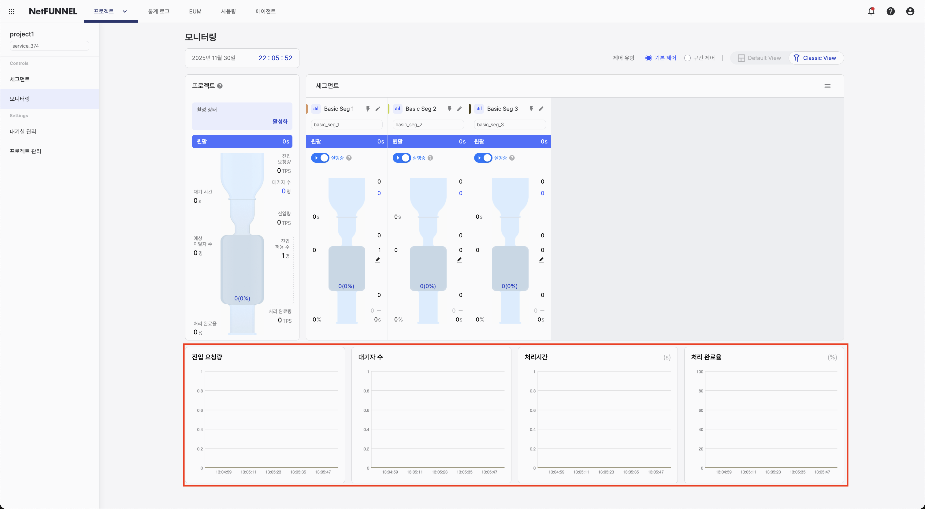
Screen structure
The screen is organized as follows.
- Control type selection: Choose control type (Basic / Section) and switch view mode
- Project section: Summary dashboard with values aggregated across all segments
- Segment section: Per-segment status and run/pause controls
- Bottom time series chart: Trends over time for four metrics (Entry Requests, Queue, Process Time, Outflow rate)
Control type selection
At the top of the screen, choose which segment type to display:
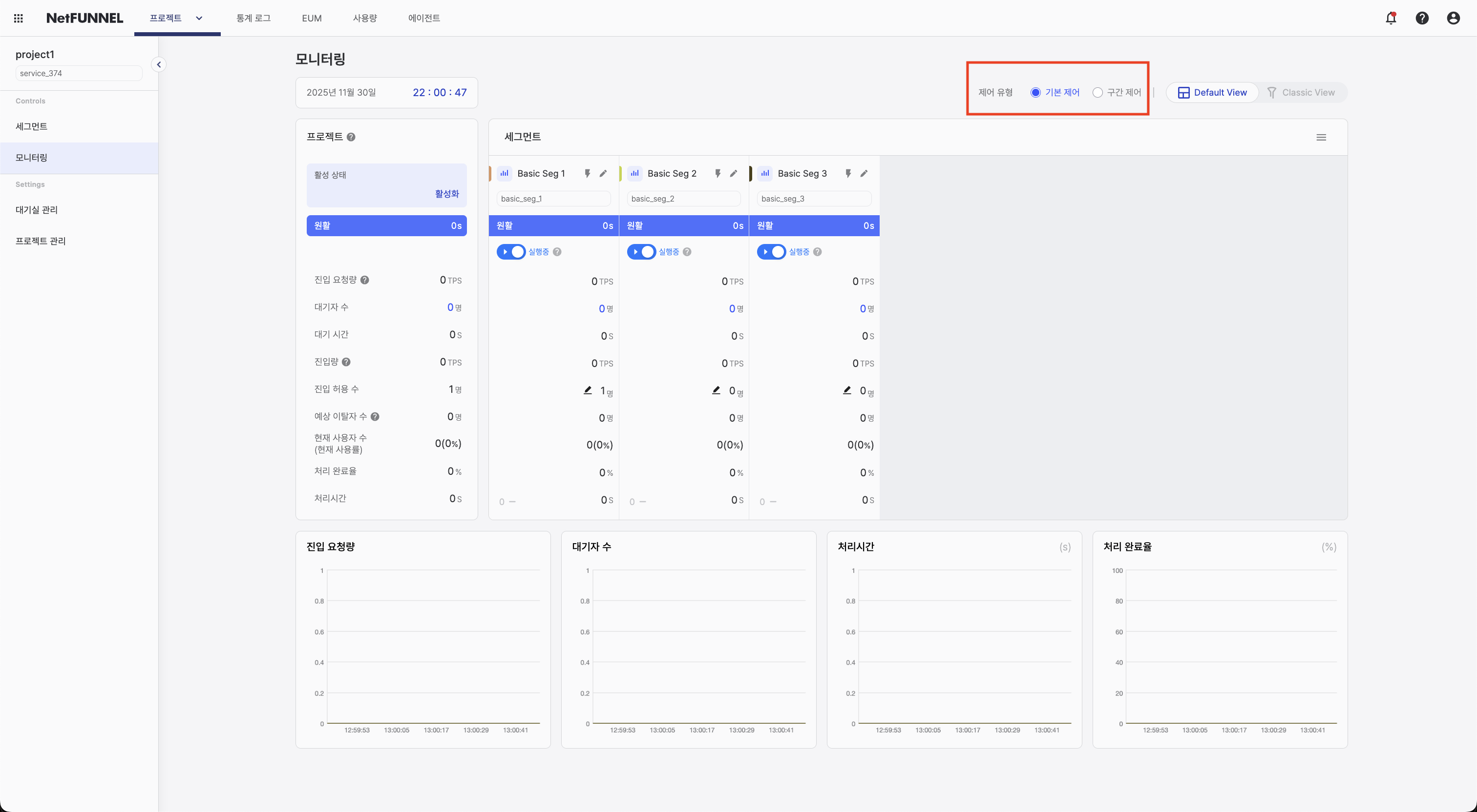
Available options:
- Basic Control: View and monitor Basic Control segments
- Section Control: View and monitor Section Control segments
How to use:
- Click the tab for the control type you want
- The interface filters to show only segments of that type
- Metrics and calculations differ by control type, so each type has its own monitoring view
Basic Control and Section Control segments have different meaningful metrics and operational behavior. Separating them lets you see what matters most for each segment type.
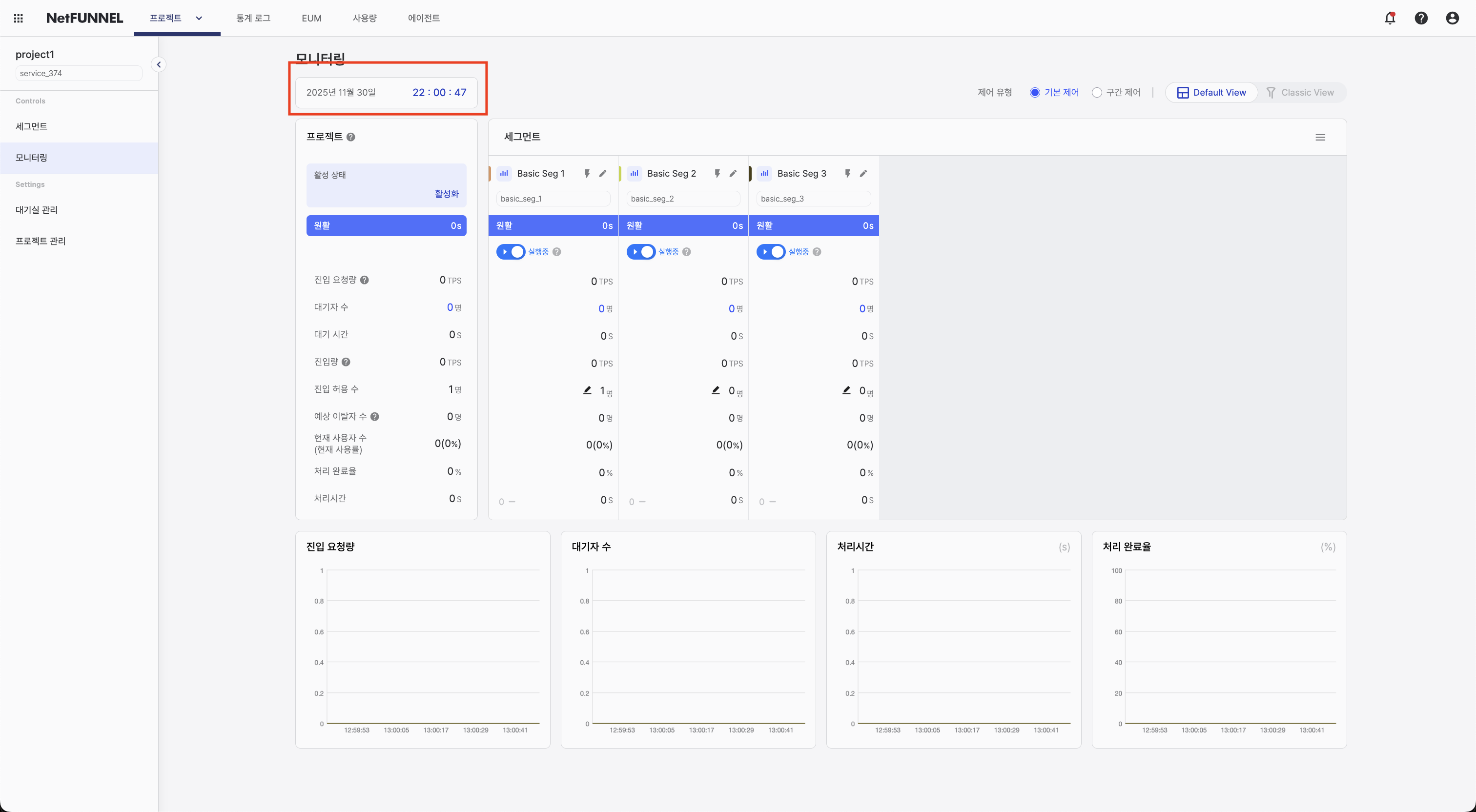
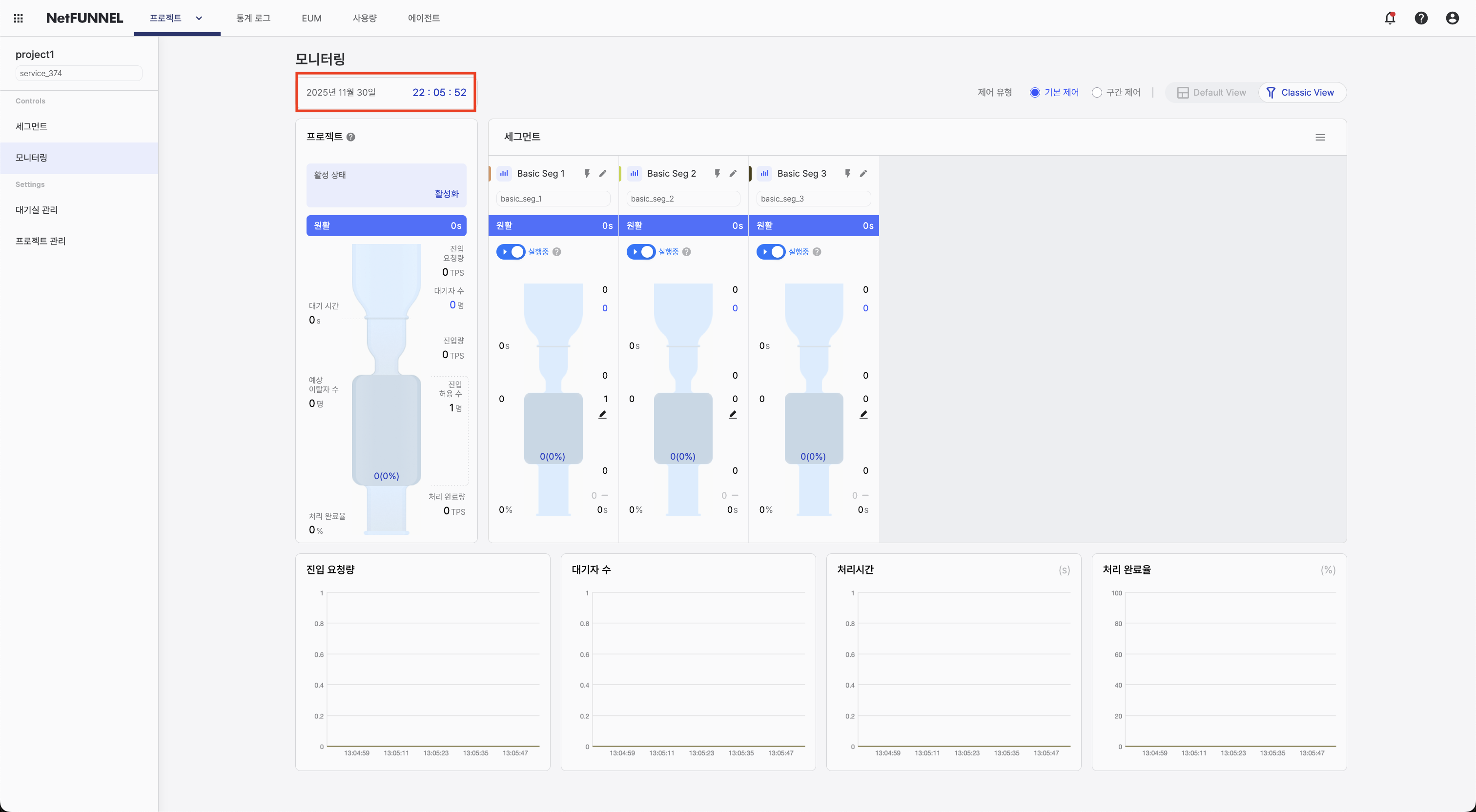
Current time display
Shows the current time for the selected timezone.
Project-level section
The project-level section combines data from all segments and shows aggregated metrics for the whole project:
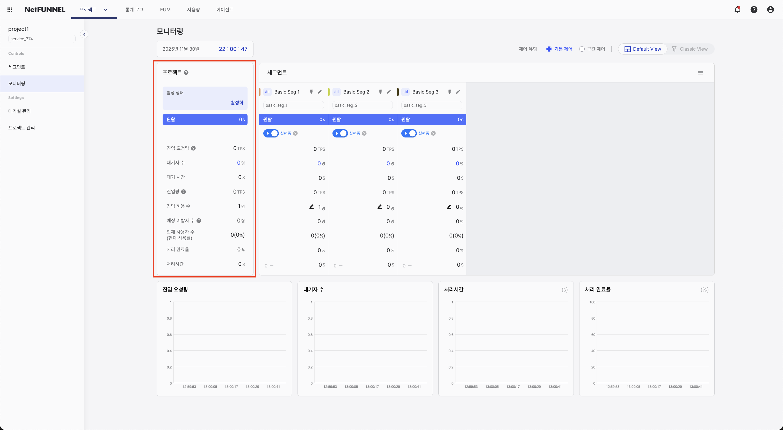
Displayed information:
-
Active status: Project activation state. Shows "Active" when the project is on and "Inactive" when off.
-
Waiting status: Waiting conditions using Fast / Medium / Slow-style labels from average wait time. Slow indicates substantial waiting in the segment.
-
Entry Requests: Per-second sum of newly arrived requests for using the service, across all segments (TPS).
-
Queue: Total users waiting across all segments.
-
Wait time: Average wait time across all segments (cumulative wait time ÷ number of wait events).
-
Expected Dropouts: Users who entered the waiting room but then closed the browser or lost connection, totaled across all segments.
-
Inflow: Per-second average of successful service entries across all segments (TPS).
-
Limited Inflow: Sum of Limited Inflow values from all segments.
-
Current number of users (Current usage rate): Total active users across all segments and usage rate shown as
(current users / Limited Inflow) × 100(capped at 100%). -
Outflow rate: Share of users who completed the service and returned the key.
-
Process Time: Average processing time (actual service usage time ÷ number of usage events).
Use project-level metrics to understand overall system state and compare with individual segment metrics.
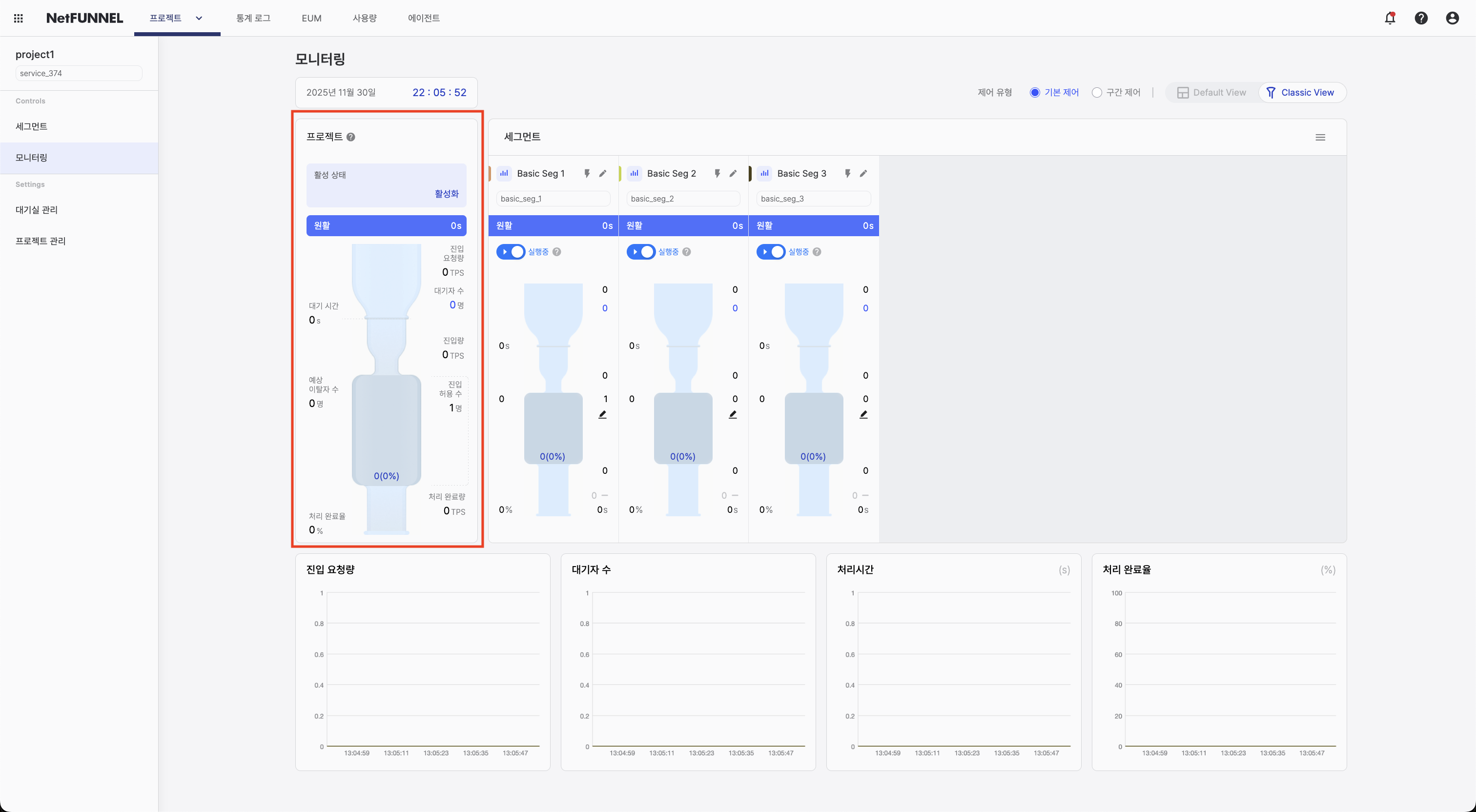
Segment-level section
The segment-level section shows metrics per segment in five subsections:
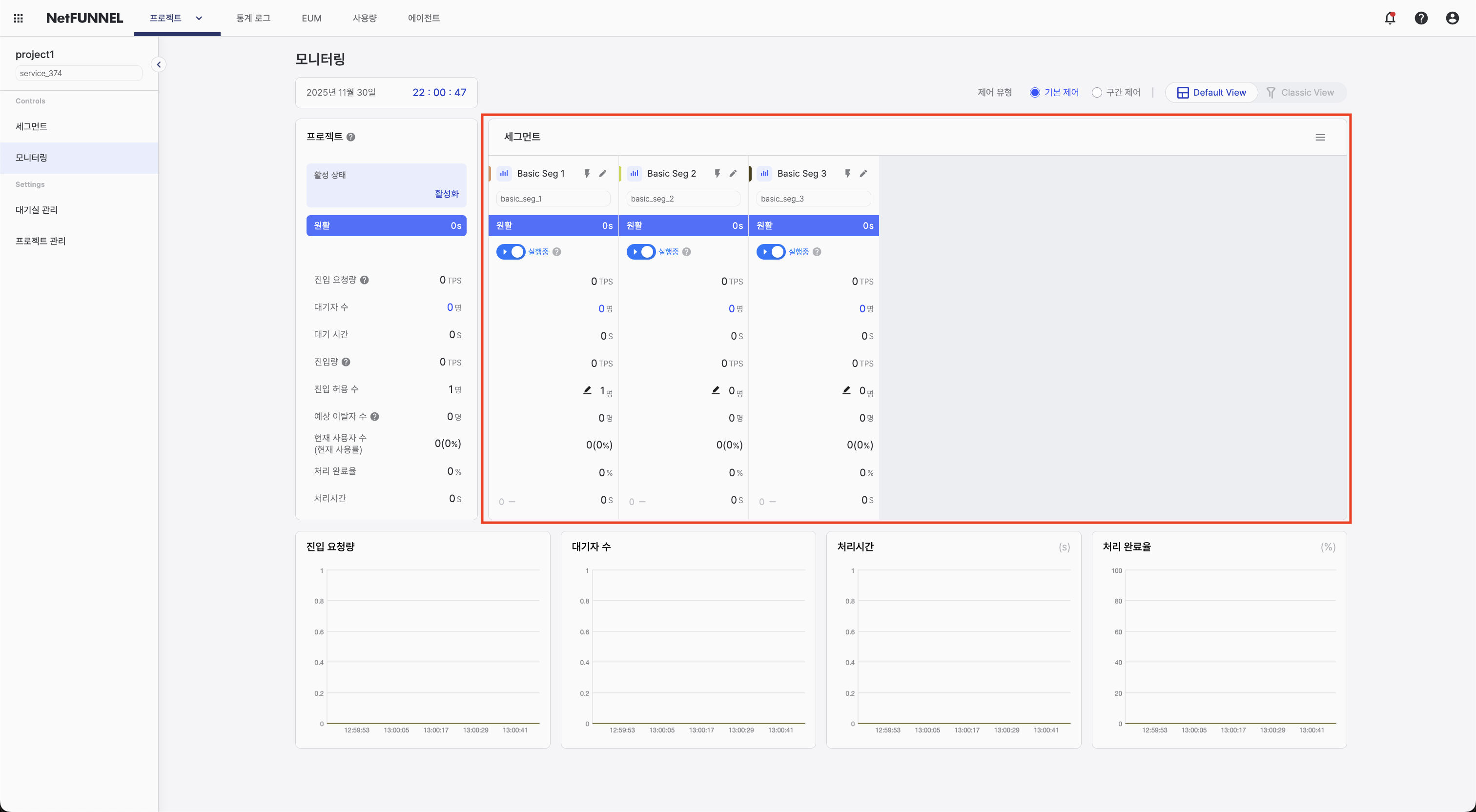
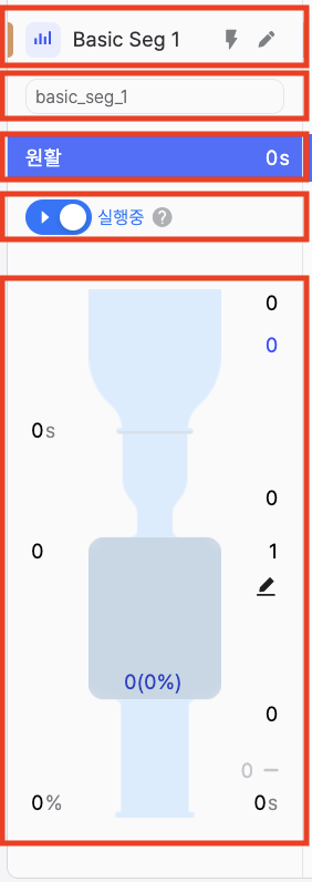
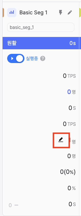
Subsection 1: Segment header
- Graph color: Swatch matching the time series chart below (cannot be changed)
- View chart button: Toggle this segment’s visibility on the time series chart
- Segment name: Name of the segment
- Segment edit button: Open the segment configuration page
Subsection 2: Segment key
- Shows the unique segment key identifier
Subsection 3: Waiting status
- Waiting conditions using Fast / Medium / Slow-style labels from average wait time. Slow indicates substantial waiting in the segment.
Subsection 4: Segment run / pause
Run/pause controls entry of customers who are waiting.
- Run: Waiting customers enter steadily according to the configured Limited Inflow.
- Pause: Entry from the waiting room is suspended temporarily; customers see an “entry suspended” message. Customers already inside keep using the service; when you resume, entry continues from the same queue order.
Subsection 5: Metrics
- Entry Requests: Per-second count of newly arrived requests for using this segment (TPS).
- Queue: Users waiting for this segment.
- Wait time: Average wait time for this segment (cumulative wait time ÷ number of wait events).
- Expected Dropouts: Users who entered the waiting room for this segment but closed the browser or lost connection.
- Inflow: Per-second average of successful service entries for this segment (TPS).
- Limited Inflow: Configured Limited Inflow for this segment.
- Current number of users (Current usage rate): Active users for this segment and
(current users / Limited Inflow) × 100usage rate (capped at 100%). - Outflow rate: Share of users who completed the service and returned the key for this segment.
- Process Time: Average of actual service usage time ÷ number of usage events for this segment.
Additional features:
- Drag and drop: Reorder segment cards to prioritize important segments
- Limited Inflow edit: Click to adjust Limited Inflow directly on the monitoring screen
Compare metrics across segments in the table. Drag segments to reorder monitoring as needed.
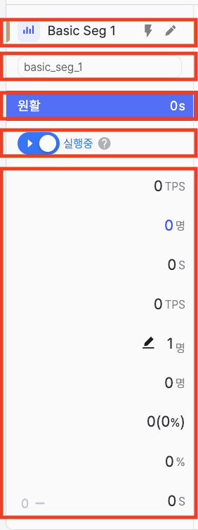
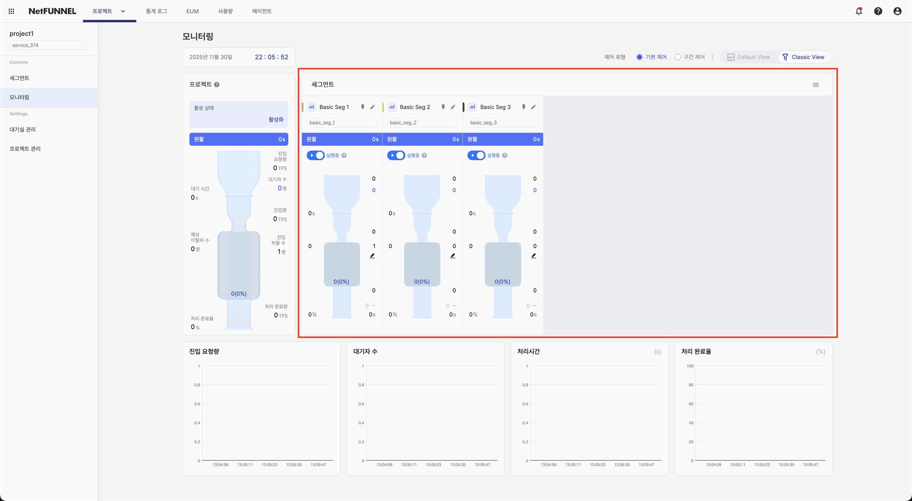
Time series graph section
The time series chart shows metrics over time:
Displayed metrics:
- Entry Requests: Per-second count of newly arrived requests (by segment)
- Queue: Users waiting (by segment)
- Process Time: Average of actual service usage time ÷ usage events (by segment)
- Outflow rate: Share of users who completed the service and returned the key (by segment)
Interactive features:
- Segment toggle: Click the graph icon next to a segment to show or hide it on the chart
- Hover details: Hover a point to see the exact value at that time
- Multiple segments: Turn several segments on to compare at once
Toggle segments to compare patterns. Use the chart to spot trends and relate them to operational events.
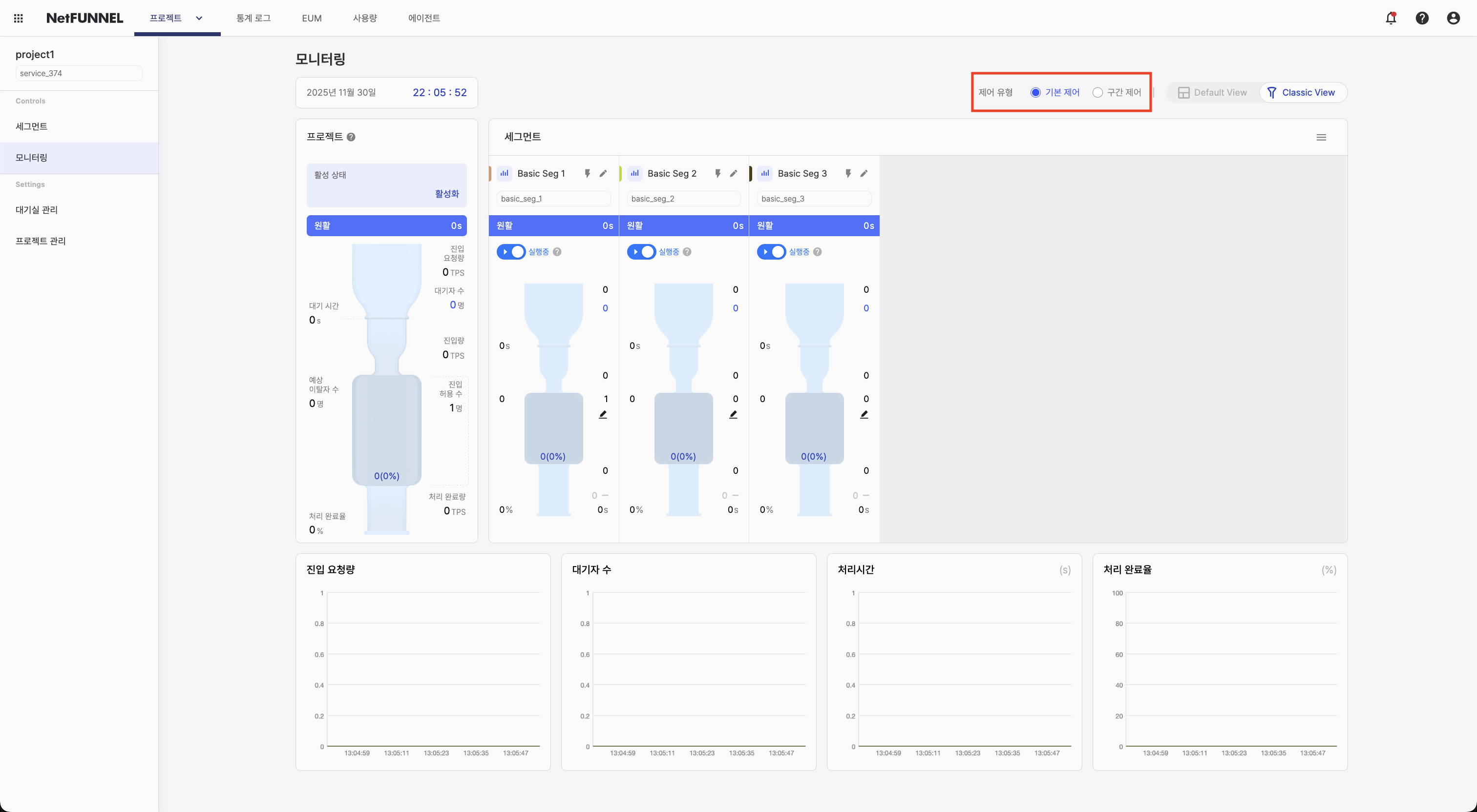
Classic View
Classic View shows traffic flow with a visual funnel animation, which helps for continuous monitoring and intuitive reading of traffic patterns.
Screen layout
Classic View includes these main areas:
- Control type selection: Choose segment type (Basic Control or Section Control)
- View mode selector: Switch between Default View and Classic View
- Current time display: Current time for reference
- Project-level section: Aggregated metrics for the project
- Segment-level section: Metrics per segment
- Time series graph: Metrics over time
Control type selection
At the top of the screen, choose which segment type to display:
Available options:
- Basic Control: View and monitor Basic Control segments
- Section Control: View and monitor Section Control segments
How to use:
- Click the tab for the control type you want
- The interface filters to show only segments of that type
- Metrics and calculations differ by control type, so each type has its own monitoring view
Current time display
Shows the current time for the selected timezone.
Project-level section
The project-level section combines data from all segments and shows aggregated metrics for the whole project:
Displayed information:
-
Active status: Project activation state. Shows "Active" when the project is on and "Inactive" when off.
-
Waiting status: Waiting conditions using Fast / Medium / Slow-style labels from average wait time. Slow indicates substantial waiting in the segment.
-
Entry Requests: Per-second sum of newly arrived requests for using the service, across all segments (TPS).
-
Queue: Total users waiting across all segments.
-
Wait time: Average wait time across all segments (cumulative wait time ÷ number of wait events).
-
Expected Dropouts: Users who entered the waiting room but then closed the browser or lost connection, totaled across all segments.
-
Inflow: Per-second average of successful service entries for the whole project (TPS).
-
Limited Inflow: Sum of Limited Inflow values from all segments.
-
Current number of users (Current usage rate): Total active users across all segments and
(current users / Limited Inflow) × 100usage rate (capped at 100%). -
Outflow rate: Share of users who completed the service and returned the key.
-
Completions (Outflow volume): Cumulative count of sessions that ended with the key fully returned (project aggregate).
Use project-level metrics to understand overall system state and compare with individual segment metrics.
Segment-level section
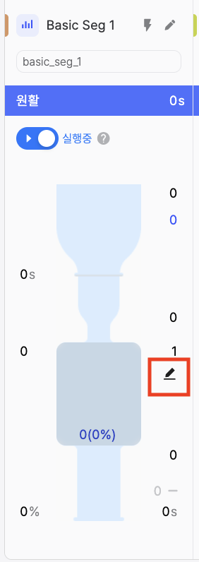
The segment-level section shows each segment’s metrics with a visual funnel animation, in five subsections:
Subsection 1: Segment header
- Graph color: Swatch matching the time series chart below (cannot be changed)
- View chart button: Toggle this segment’s visibility on the time series chart
- Segment name: Name of the segment
- Segment edit button: Open the segment configuration page
Subsection 2: Segment key
- Shows the unique segment key identifier
Subsection 3: Waiting status
- Waiting conditions using Fast / Medium / Slow-style labels from average wait time. Slow indicates substantial waiting in the segment.
Subsection 4: Segment run / pause
Run/pause controls entry of customers who are waiting.
- Run: Waiting customers enter steadily according to the configured Limited Inflow.
- Pause: Entry from the waiting room is suspended temporarily; customers see an “entry suspended” message. Customers already inside keep using the service; when you resume, entry continues from the same queue order.
Subsection 5: Metrics
- Entry Requests: Per-second count of newly arrived requests for using this segment (TPS).
- Queue: Users waiting for this segment.
- Wait time: Average wait time for this segment (cumulative wait time ÷ number of wait events).
- Expected Dropouts: Users who entered the waiting room for this segment but closed the browser or lost connection.
- Inflow: Per-second average of successful service entries for this segment (TPS).
- Limited Inflow: Configured Limited Inflow for this segment.
- Current number of users (Current usage rate): Active users for this segment and
(current users / Limited Inflow) × 100usage rate (capped at 100%). - Outflow rate: Share of users who completed the service and returned the key for this segment.
- Process Time: Average of actual service usage time ÷ number of usage events for this segment.
- Completions (Outflow volume): Cumulative count for this segment of sessions that ended with the key fully returned.
Visual features:
- Visual funnel: Animated funnel with droplet-style traffic flow
Reading the funnel:
The funnel has three main parts:
Section 1: Entry Requests (falling droplets)
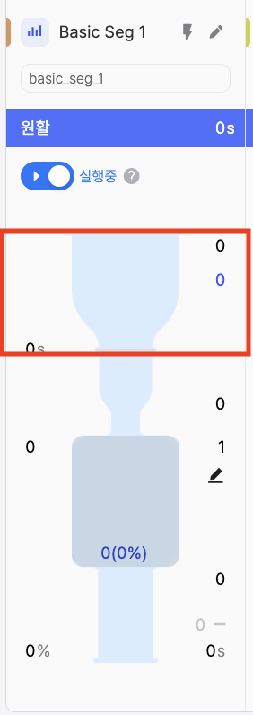
Falling droplets represent initial entry requests (everyone trying to access the service). Each droplet is a request entering the system—the demand side of traffic.
Section 2: Service entry (funnel container)
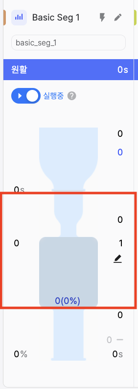
The funnel container represents requests that received a PASS and entered the service (Inflow). The visuals mean:
- Funnel depth: Limited Inflow (configured capacity)
- Water level: Active users (users actively using the service now)
- Water level ratio: Active user rate (share of Limited Inflow in use)
When the level nears the depth (Limited Inflow), new requests are queued instead of entering immediately.
Section 3: Service exit (exiting droplets)
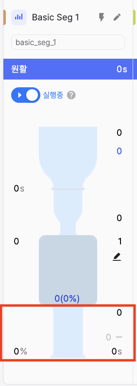
Exiting droplets represent explicit completion (completions). How fast they appear reflects how quickly capacity is freed for new users.
- Many droplets fall in, few enter: High demand; Limited Inflow may be tight
- Level near funnel depth: Active users near Limited Inflow—capacity almost full
- Few droplets exit: Low completions—may indicate long timeouts
- Steady flow: Healthy pattern with balanced entry and exit
Additional features:
- Limited Inflow edit: Click to adjust Limited Inflow directly on the monitoring screen
Time series graph section
The time series chart shows metrics over time:
Displayed metrics:
- Entry Requests: Per-second newly arrived requests over time (by segment)
- Queue: Waiting users over time (by segment)
- Process Time: Over time and by segment: average of actual service usage time ÷ usage events
- Outflow rate: Share of users who completed the service and returned the key (by segment)
Interactive features:
- Segment toggle: Click the graph icon next to a segment to show or hide it on the chart
- Hover details: Hover a point to see the exact value at that time
- Multiple segments: Turn several segments on to compare at once
Toggle segments to compare patterns. Use the chart to spot trends and relate them to operational events.
Classic View is strong for seeing what is happening through the funnel; Default View is strong for how much in numbers. Use both as needed.
Common operations
Adjusting Limited Inflow
You can change Limited Inflow quickly on the monitoring screen without opening the segment configuration page. Available in both Default View and Classic View.
Default View:
In the segment-level section, click the edit icon next to Limited Inflow.
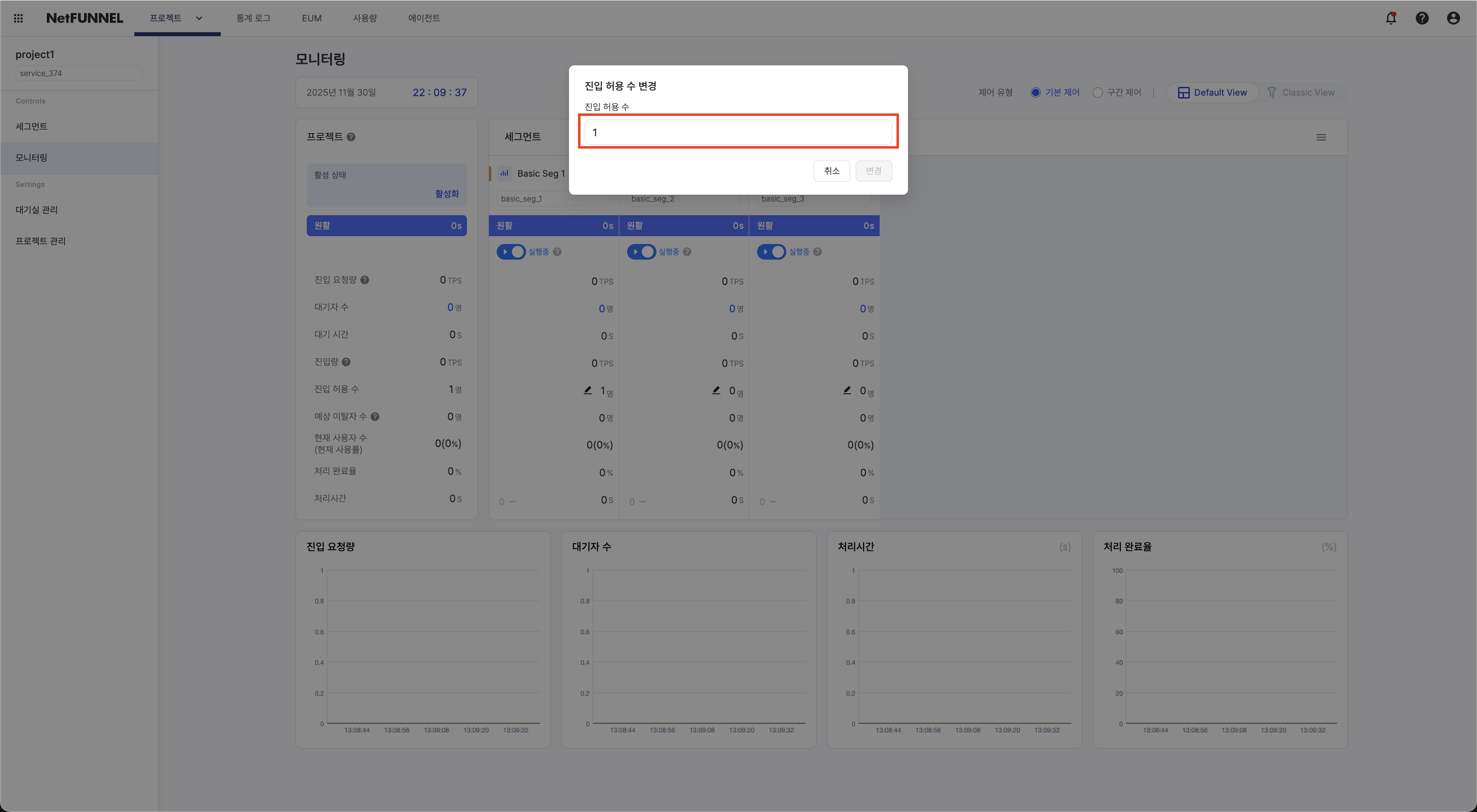
Classic View:
In the segment-level section, click the edit icon next to Limited Inflow. Enter the new value in the dialog and confirm. Watch metrics update in real time after the change.
- Increase: Do it gradually (about 10–20% at a time) and watch server resources
- Decrease: You can cut more aggressively (about 40–50%) to protect capacity quickly
- Always watch Process Time and server metrics while adjusting
Reordering segments
Drag segment cards to reorder. The order lasts for your session.
Filtering the chart
Click the graph icon next to a segment name to show or hide it on the time series chart.
Switching control type
Click the control type tab (Basic Control or Section Control) at the top. The interface loads the view for that type with the correct metrics and calculations.